A data-visualization study of graduate employment rates, field-of-study relevance and youth unemployment in Canada, translating several datasets into a coherent family of comparative graphics.
年份 / YEAR2018
角色 / ROLE资料研究、数据分析、图表设计与视觉系统Research, data analysis, chart design and visual system development
周期 / DURATION2 周 · 独立与小组协作2 weeks · Individual and group work
工具 / TOOLSAdobe Illustrator · Adobe Photoshop · Microsoft Excel · Microsoft Word
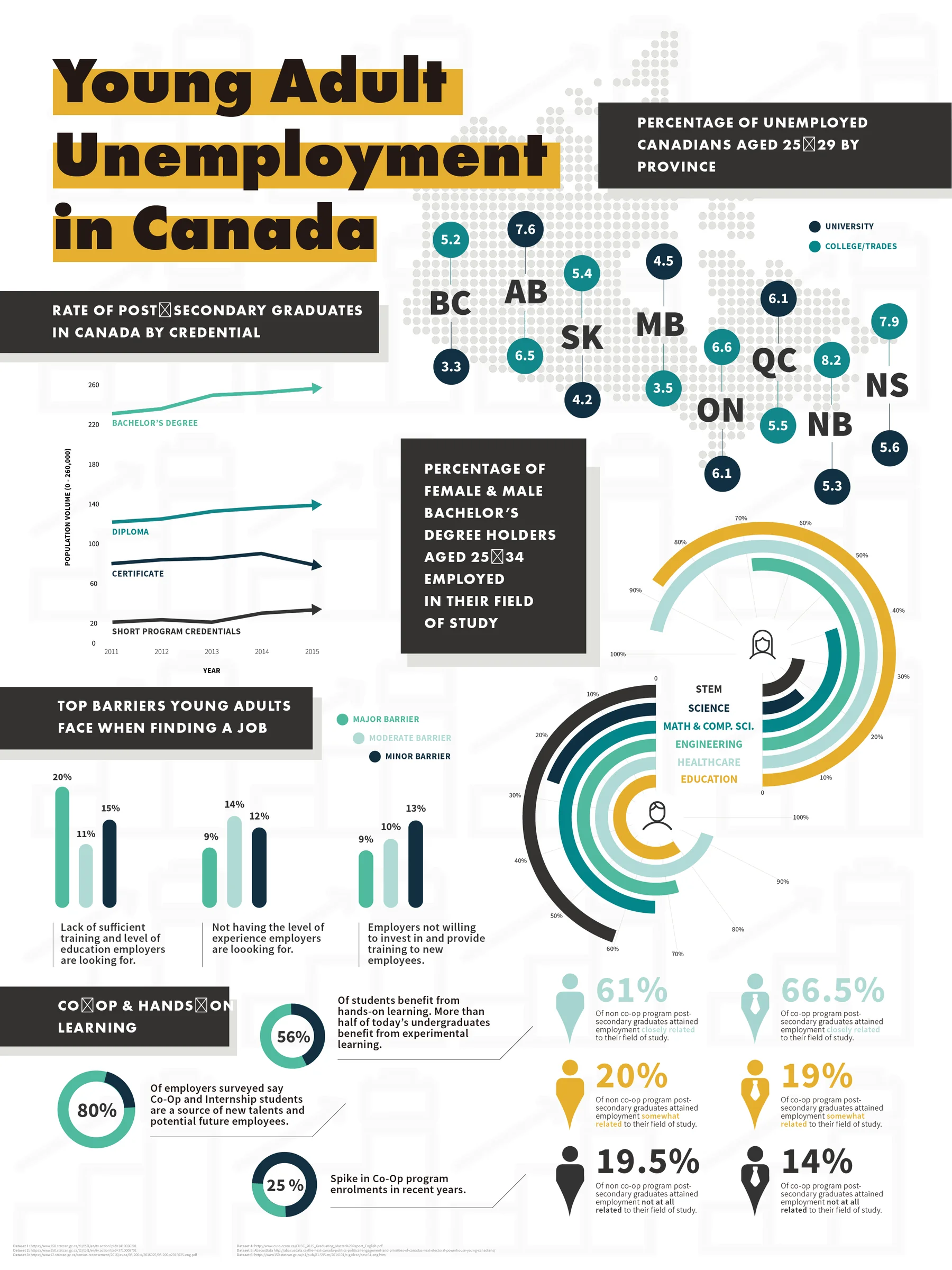
加拿大青年失业率信息图全图Full infographic about young adult unemployment in Canada
01
背景Background
项目来自 Sheridan College 的数据可视化课程,内容同时包含个人设计与小组统一呈现。研究对象涉及高校毕业生就业、专业与工作关联度以及青年失业率。
Created for a Sheridan College data-visualization course, the project combined individual analysis with a shared group presentation system across several graduate-employment topics.
02
目标Objective
对加拿大高校就业相关数据进行收集、筛选和比较,并选择能够同时表达群体差异与时间变化的图表形式。
Collect, filter and compare Canadian graduate-employment data, then select chart forms that reveal both demographic differences and change over time.
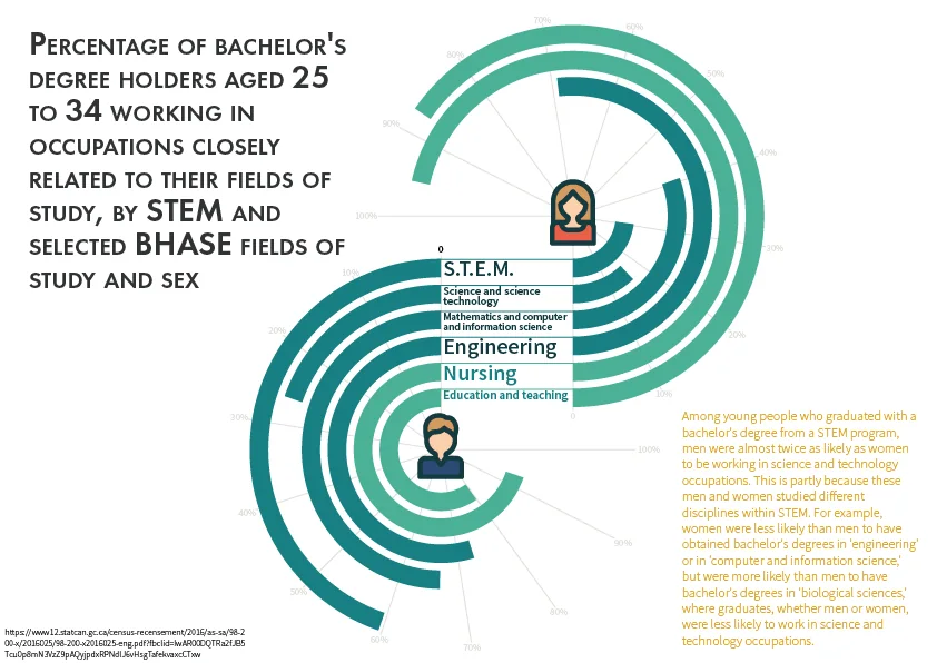
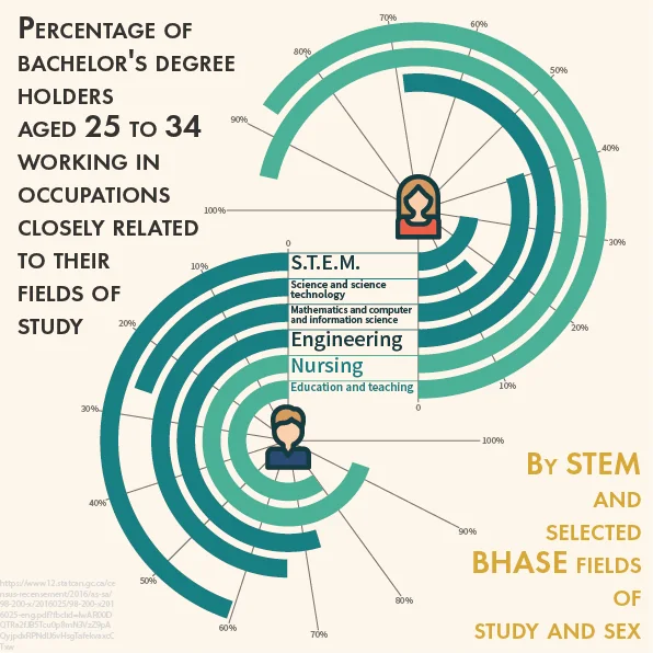
Circular bars, polar-area charts, mapping and line graphs were matched to different questions. A shared style guide aligned color, typography and annotation across individual and group contributions.
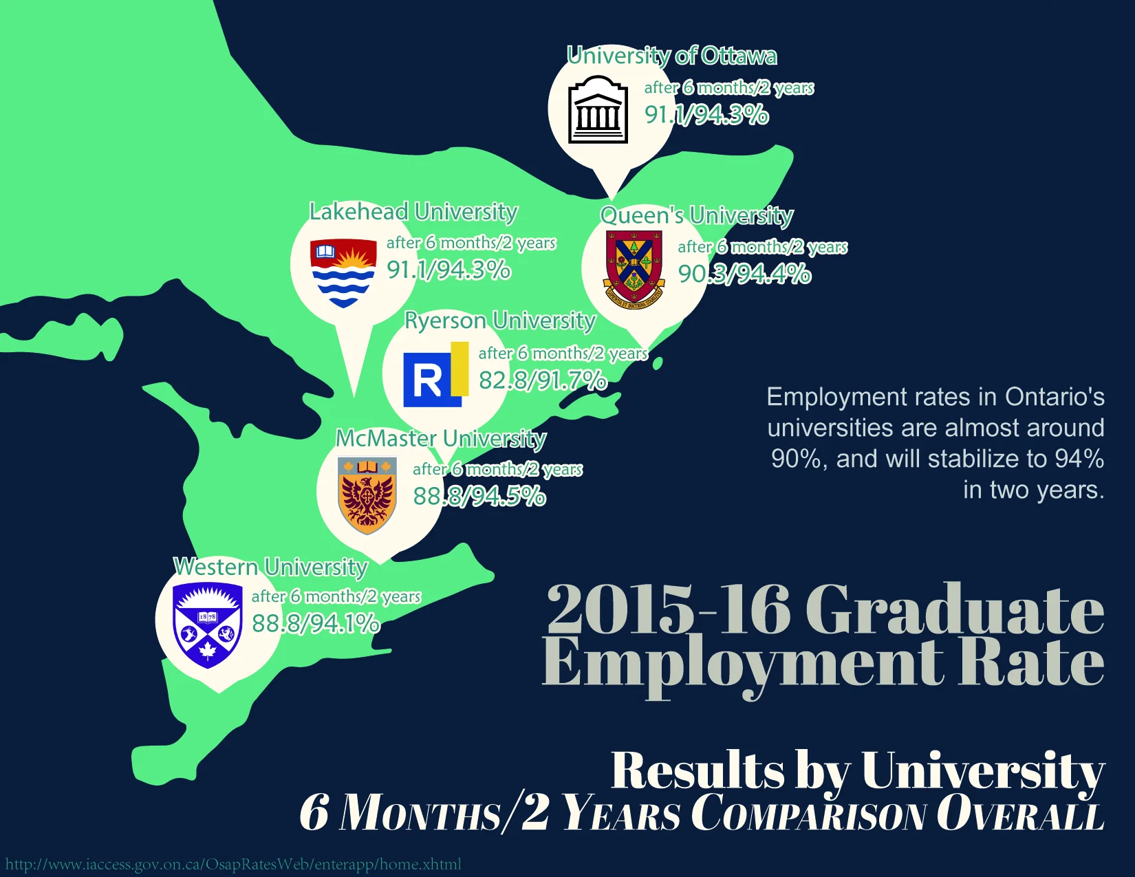
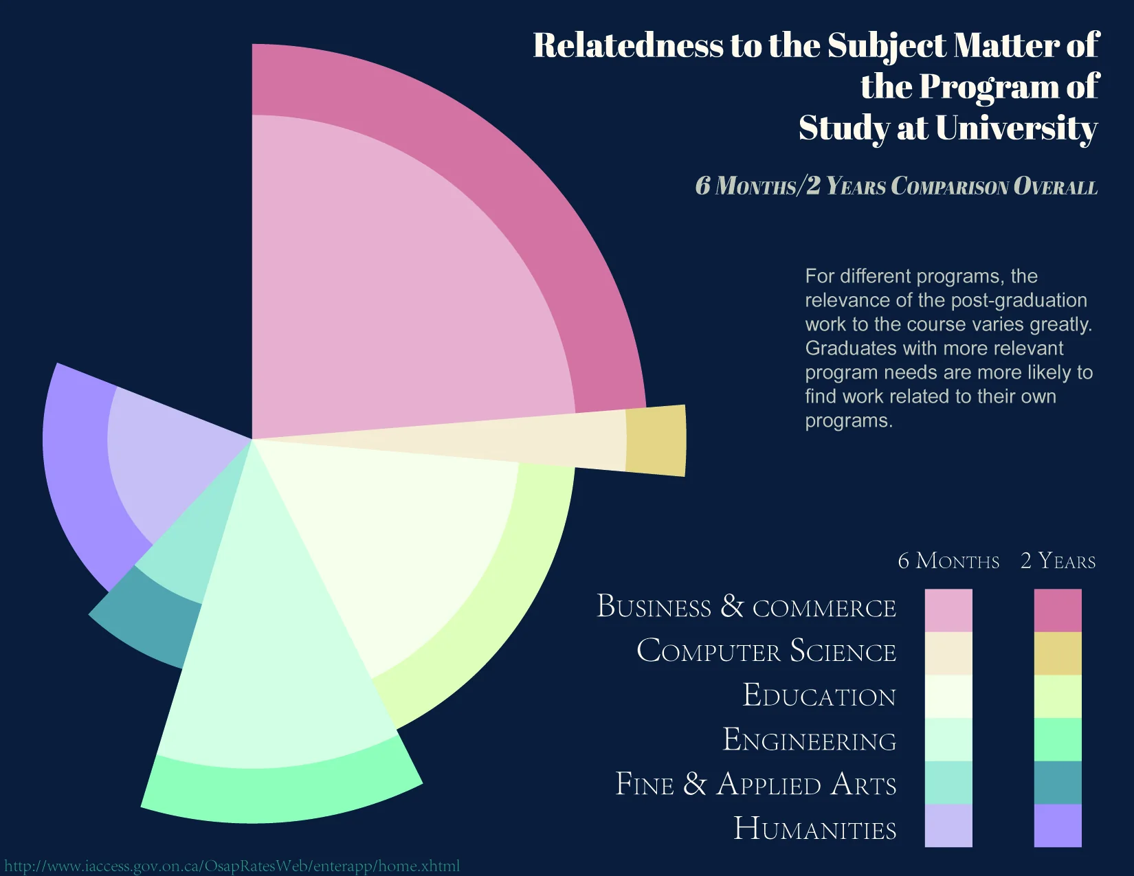
The result is a set of standalone yet related graphics covering field-of-study relevance, employment six months and two years after graduation, and changes in youth unemployment.
项目媒体 / Project Media
07 ITEMS
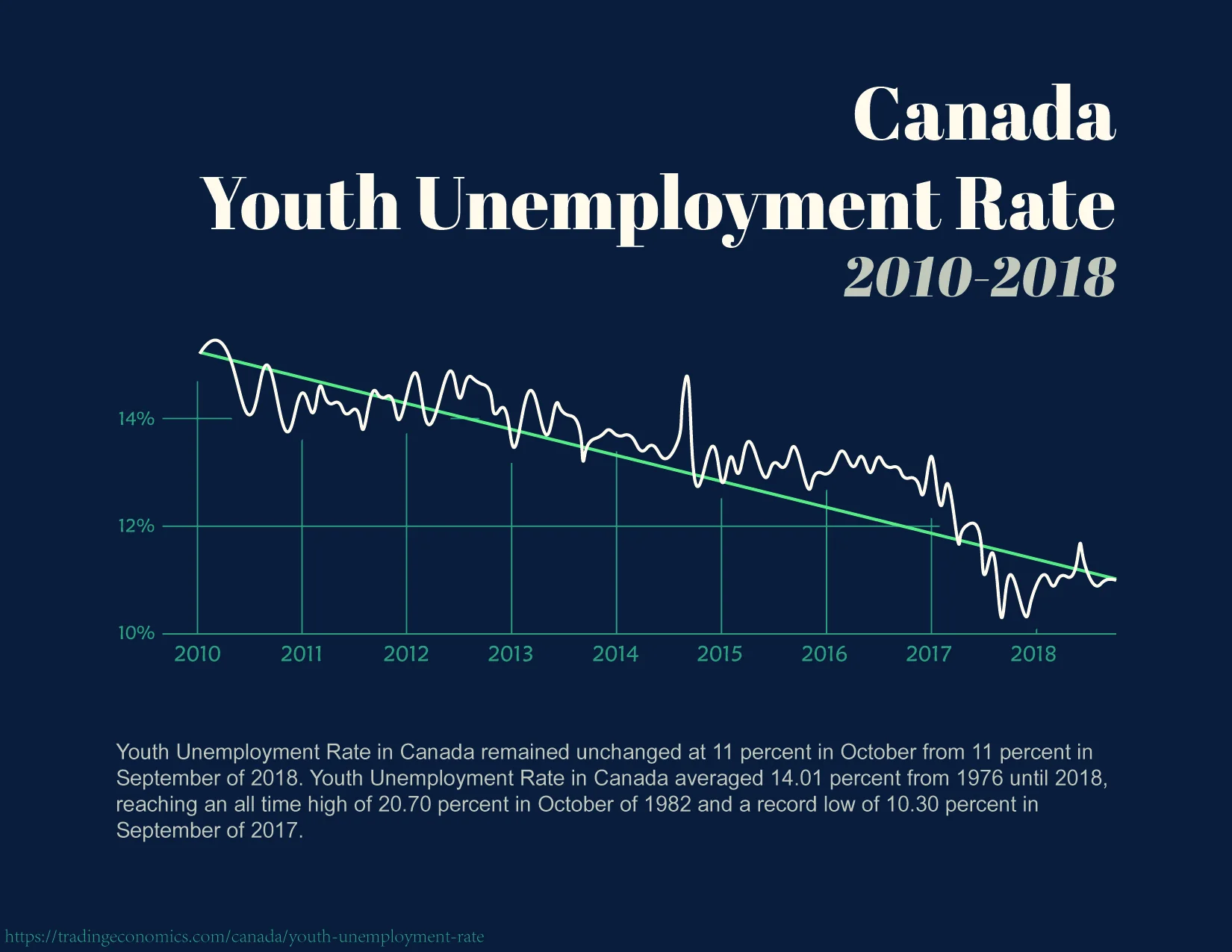
01加拿大青年失业率信息图Young adult unemployment infographic for Canada02数据可视化项目的配色与排版规范Color and typography style guide for the visualization project03安大略省高校毕业就业率地图Map of graduate employment rates at Ontario universities04按专业与性别比较工作内容相关度的圆形图表Circular chart comparing field relevance by discipline and gender05专业与工作关联率的方形图表版本Square chart showing relevance between study and occupation06毕业后就业与专业匹配变化的极区图Polar-area chart of employment relevance after graduation072010 至 2018 年加拿大青年失业率折线图Line chart of Canadian youth unemployment from 2010 to 2018